
Colour Mixing with the Roman Szmal Aquarius Mixing Palette Watercolour Set
8 min read [ad_1]
Roman Szmal Aquarius Watercolours have a growing popularity thanks to their vast range of single pigment colours. Here, Lisa Takahashi reviews the 14 full pan Mixing Palette set, and puts their colour mixing potential to the test.
Roman Szmal Aquarius Watercolour paints are a range of professional artist grade colours that are made in Poland. Production is kept in small batches to ensure consistent and dependable quality control, with an impressive 180 shades in the range. The majority of these (117 at last count) are single pigment colours, meaning that the colours appear vivid and full of vibrancy. The Mixing Palette set comprises 14 pans, 13 of which are single pigment colours, plus a two-pigment Quinacridone Gold.
First Impressions of the Roman Szmal Aquarius Mixing Palette Set
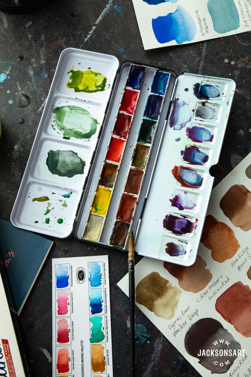
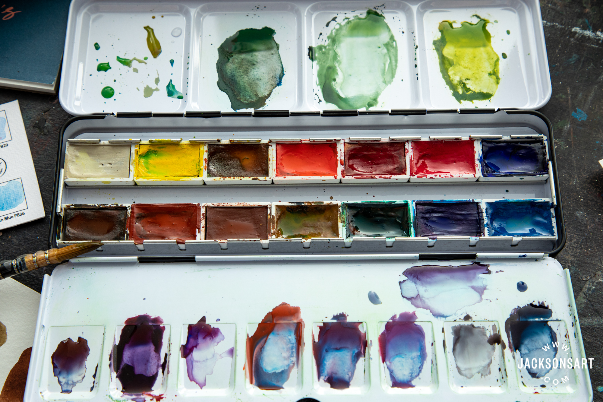
The metal enamel box is fairly standard in its design, with a folding out palette, some extra colour mixing space on the inside of the lid, and a thumb loop on the bottom to help keep it secure in your hand while painting. There is no extra space for adding more pans, but there is room for a brush (or two at a push) between the two rows of colours, should you wish to travel light. Within the set is a blank printed colour chart on cold pressed paper – a great idea as it encourages you to explore each colour in turn, while creating your own hand painted colour chart.
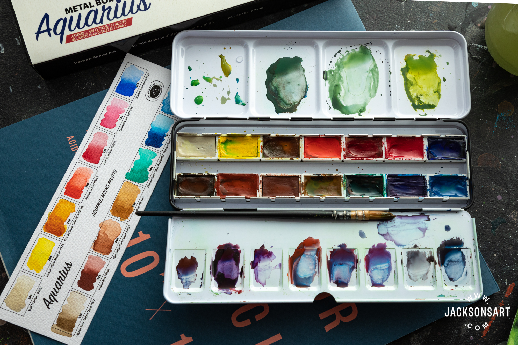
This also doubles up as a map of all your pans so you can tell which colour is which while you are working. For this particular set, the colour chart is invaluable, as colours such as Quinacridone Gold, Quinacridone Red and Phthalo Green in particular look so considerably different in the pan to how they appear brushed out, while Cyprus Raw Umber and Cobalt Cerulean Blue display such translucency and granulating properties that may not otherwise be predicted. The pans in the set I received looked a little haphazard in how they had been filled – with some colours overflowing a little while other colours looked less full. I have since learned that I was right to assume this is as a result of the pans being filled by hand.
The enamel watercolour tin is housed within a glossy cardboard sleeve, the graphic design of which has more of a hint of the 1990s about it! Roman Szmal’s slogan ‘Art Materials for Advanced Artists’ is printed top right, and offers some gentle reassurance on those occasional bad painting sessions that we all face from time to time.
Colour Choices within Roman Szmal’s Aquarius Mixing Palette
It was only on painting the colour chart that I released that this set does not contain Ivory Black, Chinese White, Raw Sienna, Cadmium Yellow or Red, no Olive or Sap Green, or Alizarin Crimson – all colours I would expect from a basic palette set. Additionally I noticed the number of synthetic colours present – Hansa Yellow Medium, Quinacridone Gold and Red, Phthalo Blue and Green. On one hand I felt reassured about the colour strength and permanence of these pigments, but I was curious to see whether they were capable of subtler colour mixes – the mixes you might crave when painting a traditional landscape, portrait or still life. I love the inclusion of Buff Titanium in this set as it’s such a useful light neutral hue that mixes beautifully with stronger colours without making them appear too pasty (as is sometimes the case when you mix with White). Hansa Yellow is a beautiful zingy yellow, but can be very powerful to work with; However, it can be tamed with a little colour mixing practice.
The Quinacridone Gold is a luminous, rich orangey gold that you can mix with the Hansa to create a softer yellow that feels a bit like Indian Yellow. Pyrrole Rubine is a great substitute for the more commonly featured Alizarin Crimson, and it dilutes to a beautiful purple-pink that would be useful in flower studies as well as skin tones. Quinacridone Red is actually a sugary pink that is fully lightfast and rather sumptuous. Other colours of note include Cyprus Raw Umber Deep, which is very transparent and subtle – a gorgeous earth colour, which can be easily overpowered by some of the other colours in this palette. It appears slightly more grey than other Raw Umbers I have used, for instance those by Winsor & Newton and Jackson’s. Cobalt Cerulean has the most prominent granulating properties which allow mixes to dry with beautiful dappled effects. Indian Red and Phthalo Blue are so powerful they should really come with a ‘use sparingly’ label! Goethite was a previously unfamiliar colour to me, but is somewhere in between Yellow Ochre and Raw Sienna, and dries evenly with only a slight granulation effect.
Painting a Quick Landscape Sketch Using Roman Szmal Aquarius Mixing Palette Set
Never let it be understated that working with unfamiliar colours can take a little getting used to. I found the colours in this set to be incredibly powerful – especially the yellows and blues, and was not especially keen on the lurid greens I mixed! You only need a small quantity of these synthetic pigments in your naturalistic mixes, and it will take getting used to if you are more familiar with organic or multiple pigment hues. However, that said I was wowed by how little colour you needed, and the noticeable character of each individual pigment. The runaway favourite colour for me was Cobalt Cerulean and how its granulating textures created a sumptuous sky wash.
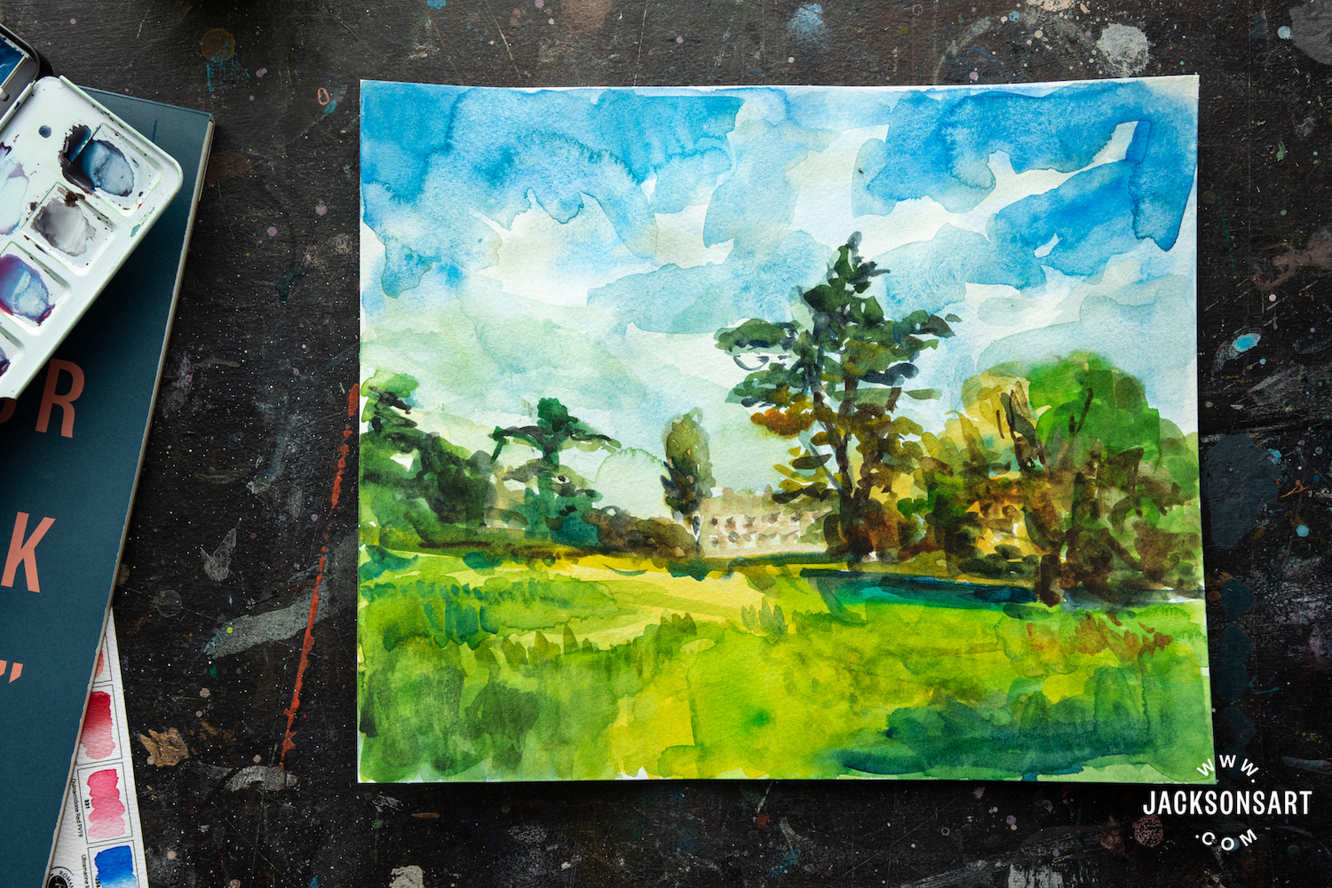
With more time it would have been possible to create a painting with many layers yet still full of luminosity and character. For my landscape study, mixing was imperative in rendering the trees and grass as there are no naturalistic greens in the set. However I can see that with more time and a more subtle approach to mixing, a jewel-like landscape is more than possible with these potential laden hues. I found the colours to be lovely and moist and lifted easily and creamily from the pan – no doubt thanks to the ingredients of glycerin and Linden Honey, as well as Gum Arabic and distilled water in their formula. However it has to be said that when colours are as powerful yet as moist as this, you might find it takes practice to control the amount of paint you lift from the pan when mixing; it’s easy to pick up too much and overpower a mix without intending to.
Further Exploration into Colour Mixing with the Roman Szmal Aquarius Mixing Palette Set
While I could see the potential and strength of the colours in the Roman Szmal Mixing Palette set, I was not satisfied with my sketch – and wanted to make sure it was simply my unfamiliarity with the colours that was to blame, rather than the potential to mix this selection of pigments. Therefore I went on to mix combinations of mainly two colours, sometimes three and occasionally four, to capture a glimpse of the mixing potential within these 14 colours. By doing this you can see what naturalistic hues are possible, and get some idea as to whether this Roman Szmal Aquarius Mixing Palette Set will work for your painting approach.

Dark Mixes
Without Ivory Black or Paynes Grey, it was important to see what dark mixes could be created with the colours in this Mixing Palette set. I was pleased to find an ability to mix some attractive cool and warm near-blacks, and inadvertently made some lovely dark Pine Greens and rich granulating browns in the process as well.

Browns
I then focussed my attention on mixing browns. The variety possible in a very short space of time was reassuring – this is thanks to the array of reds and rusty colours in the set that easily combine with blue to make these rich earthy hues.
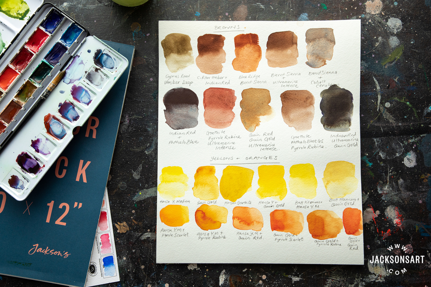
Yellows and Oranges
I do feel this set is lacking another shade of yellow. Hansa Yellow is not discreet or subtle – it’s a powerful primary yellow with little nuance or surprise in its undertone. Consequently aside from tinting it a bit in order to get a slightly pink version, or mustard version of the same colour, there’s not a whole lot of variety. I would have liked to see a Green Gold or an Indian Yellow, or a Yellow-Orange of some kind in the set, although with more time I suppose alternatives to all these suggestions would be possible with some further mixing. Another yellow would have also helped in the ability to create a greater range of oranges.
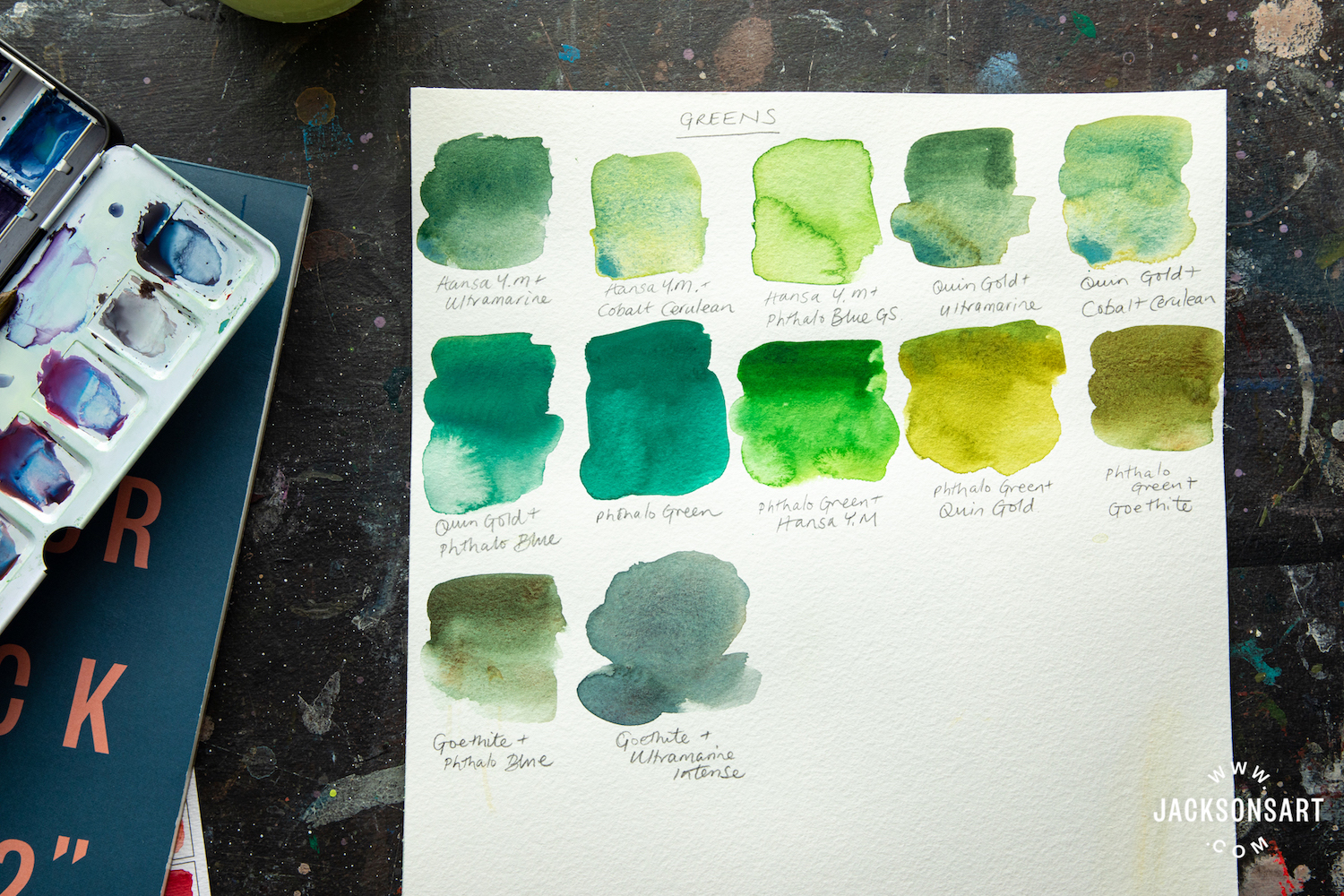
Greens
The variety of blues help to create some beautiful greens that would be invaluable when painting a lush pastoral landscape, and help you to avoid the stark shock of Phthalo Green, which is almost always too strong when used on its own! It’s particularly fascinating to see how Cobalt Cerulean partially separates out of mixes to create an almost iridescent effect.
Pinks and Reds
I love the choice of reds and pinks in the set, because you have a warm and cool and a bright pink, which is everything you could possibly need for most subject matter. When mixing these in with Buff Titanium you get some wonderful muted dusty pinks, which could be useful in painting skin tones, or light earth hues, or flowers.

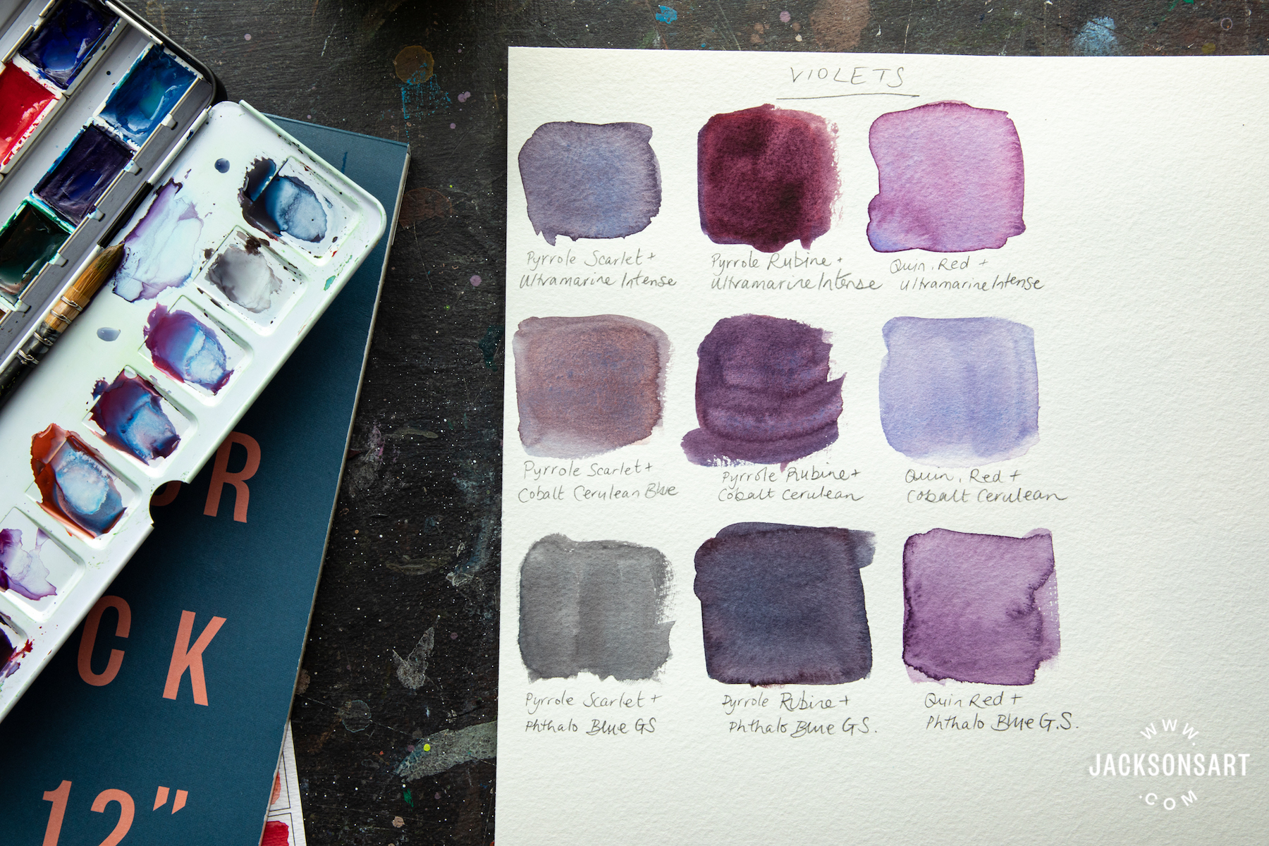
Violets
The quick Violet mixes I made hint at a greater possible variety – but here already you can see the potential for rich red-wine-esque violets as well as lavender and soft violet greys. Very useful for shadows in portraiture or landscape, as well as flowers.
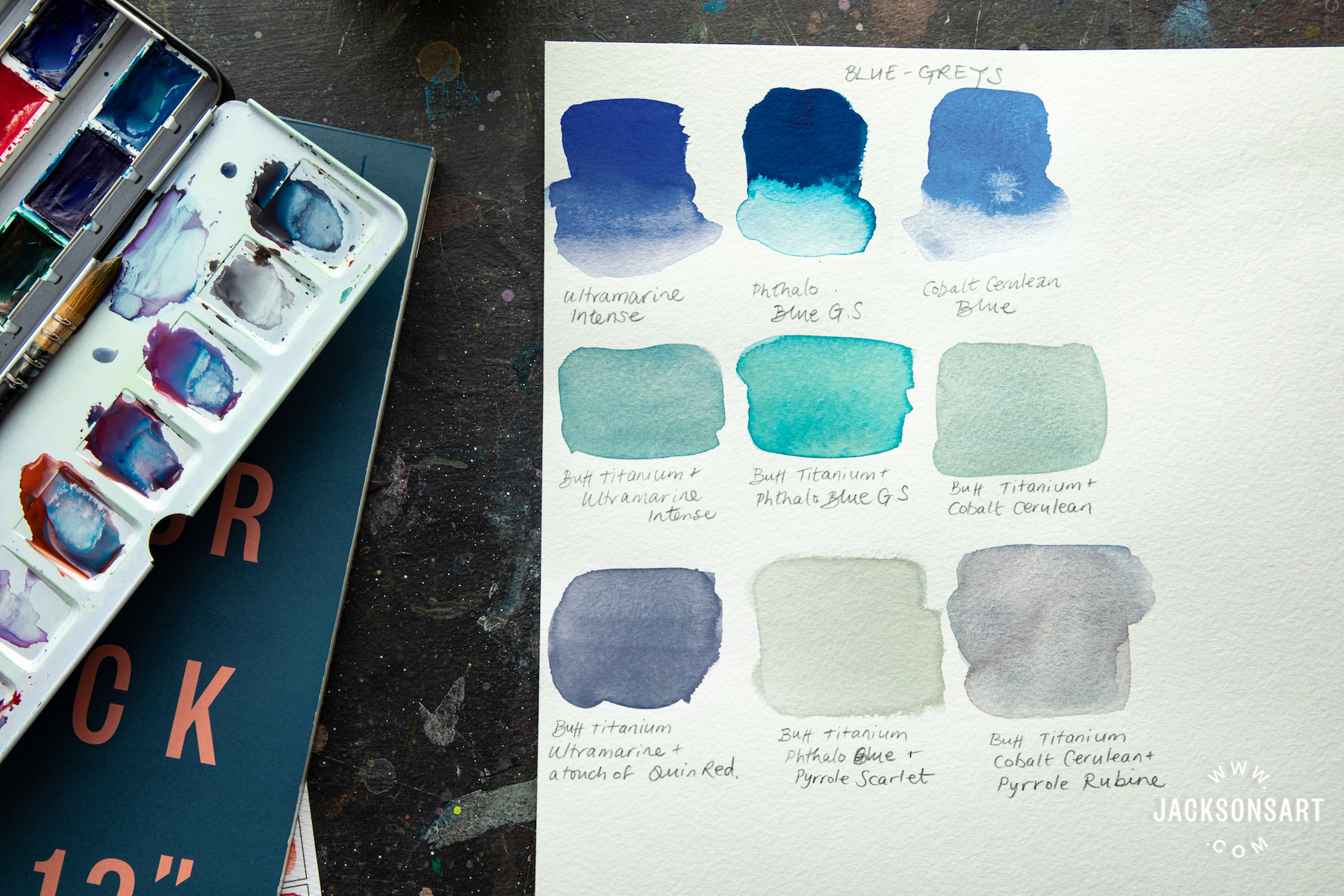
Blue-Greys
While the blues the Roman Szmal Mixing Palette set offers are strong and characterful, it’s important too to be able to mix softer blues and blue-greys, for skies, shadows and seas. The variety of cool greys you can mix is inspiring, and hints at the potential for the subtlety I like to work with alongside more dramatic impactful colours.
In short, the Roman Szmal Aquarius Mixing Palette Set has the potential for a wide variety of colour mixes. They are highly saturated, and as a result the pans will go further. The paint consistency is beautifully moist and a pleasure to work with. If you are used to more traditional, organic pigments the brightness of the synthetic pigments in this set may take getting used to, but if you invest the time there’s no doubt you will be rewarded with a really versatile palette of colours. Or alternatively, treat yourself to a second watercolour box and fill it with Roman Szmal Aquarius Ivory Black and any other more familiar colours that you might crave!
Further Reading
A First Look at Roman Szmal’s New Colours Within the Aquarius Watercolour Range
Inside the Sketchbook of Frances Ives
Art Terms Explained: Watercolour Painting
Everything You Need to Know About Watercolour Paper
[ad_2]
Source link


