
Katherine Bradford Audio Guide
11 min read [ad_1]
KB: My painting shows a woman in the act of flying. Although she is wearing a red cape to top off her achievement, I have presented her as barely able to fly, more in a state of longing than accomplishment. Because she is seen is trying to do something for which she is unequipped, we catch her in a state of vulnerability and exposure. She doesn’t have any clothes on too. On the other hand, she is shown in a hero’s mode, and can perhaps be confused at first with a superhero. In this way, I hope to balance her striving with an upbeat pose, however, improbable or unlikely.
That was me. Her striving, improbable, unlikely artist trying to take off, and being caught exposed, vulnerable in front of everybody, with a red cape to top off her achievement. She wanted to be a hero. She wanted to fly. She wanted to be something that she wasn’t yet.
I think at the time in my artist life, I felt as though I was barely being an artist. I was just getting off the ground. I was trying to be something that I wasn’t. I see now that I made a painting about that.
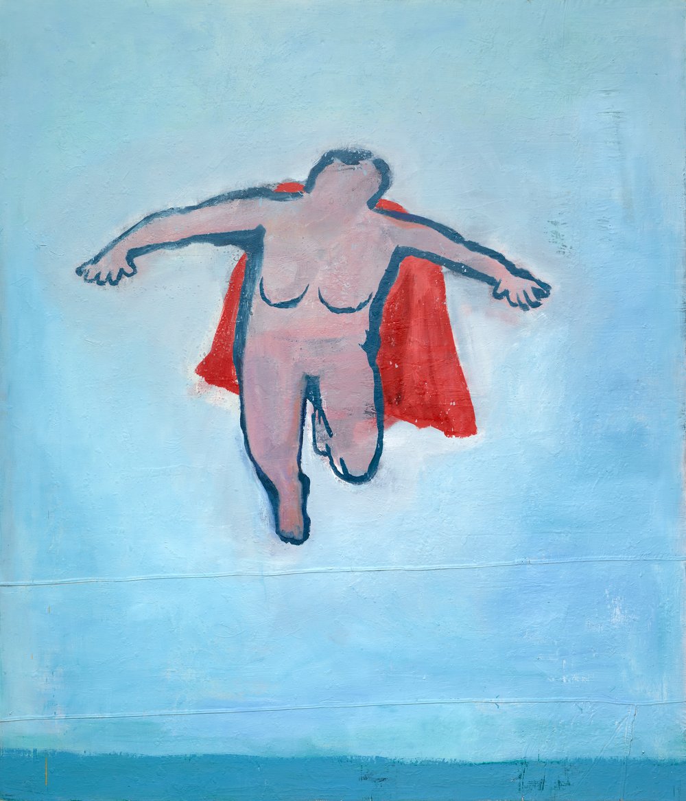
Katherine Bradford (United States, born 1942), Woman Flying, 1999, oil on canvas dropcloth, 84 x 72 inches. Portland Museum of Art, Maine. Museum purchase with support from the Friends of the Collection, 2012.14. © Katherine Bradford
KB: After I did the Woman Flying, I wanted to do another one, not just like it, but I felt like, “Oh, I’ll try this again, this idea.”
They’re both blue, and then they make a really great ground color field in which to put something. It’s so forgiving, you can put any kind of paint on a surface, make a big field, and it might look like a sky, and it might look like water. It probably will, especially if you stroke horizontally, and then what you put in it is up to you.
It took me several years to find out that a blue painting can contain things that have nothing to do with sky or water.
I wanted, again, a person in the air, buoyant. As I was painting it, there was so much blue all around that it appeared like someone in the water, not in the air.
The figure became a swimmer with her hand dipping in the water. The same kind of minimal head and some water. I think that was the beginning of perceiving a person in paint, a person in blue water, getting that idea that I could use the blue air as blue water.
I wasn’t thinking about swimming; rather I was thinking about how it feels to press forward in water unencumbered.
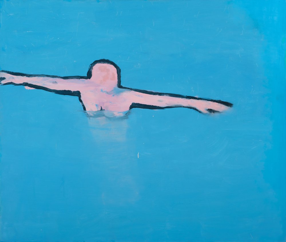
Katherine Bradford (United States, born 1942), Woman in Water, 1999, oil on canvas, 68 x 80 inches. Collection of the artist © Katherine Bradford
KB: I never made a painting of a very correct boat, and especially this one because they’re standing up in little black rowboats which is very dangerous. I was told that they would fall over, and that was not a good idea.
If you paint the open ocean at night, you know what it looks like? Nothing. It’s black with brainy green.
In order to get something more beautiful to me, I took these gem-like colors, and put them in the clothing of the people standing up in the boat.
There they are out in the open ocean at night, standing up in a little black boat, which is very foolish. Plus, they were all dressed up as if in a pageant. They all have different hats. They had colorful garments on. I only did that because I wanted to bring more color in.
JD: Sargasso was one of many nautical paintings that was first shown at Edward Thorp Gallery in New York in 2012. It features a big ship at night, dimly lit by a smoldering red haze. Sitting dangerously high in the water, it is tethered to the ocean by long, delicate necklaces of lights. This painting and others on view in this section exemplify Bradford’s early experimentation with complex textures and non-human subjects that transport the viewer to a mythical, dreamlike place.
MW: In Pond Swimmers, three figures are shown swimming in a vast body of water. All three figures have warm bright pink and orange skin, which contrasts with the cool dark blues and violets of the background. Katherine Bradford often begins her paintings with large fields of color, and lets the figures emerge from within the background. Notice how the horizontal blue strokes change throughout the painting. Find areas where the blues are solid and dark, and areas where the blues lighten and overlap.
Bring your attention to the figure in the top right corner of the painting. This figure is swimming with their head and shoulders up out of the water. The blue of the pond lightens around their yellow hair and darkens where their torso meets the water.
Notice the figure in the center of the painting floating on their back, wearing a white swim cap and a light purple bathing suit. Their face is turned up to the sky – what might they see when they look up? Take a close look at the figure’s arm. Notice how the yellows and oranges of their skin blend together with the violets and blues of the pond as their hand slips beneath the surface.
The figure at the bottom of the painting is also floating on their back. Are they lying still in the pond or is a current carrying them across the bottom of the painting?
Close your eyes and imagine yourself floating in water with the sky above and the pond all around you. Are you floating on your back, treading water, or are you diving under the water, just about to surface?
Think about the colors you might see while you swim. How might the light change the reflections on the surface or the look of what lies below?
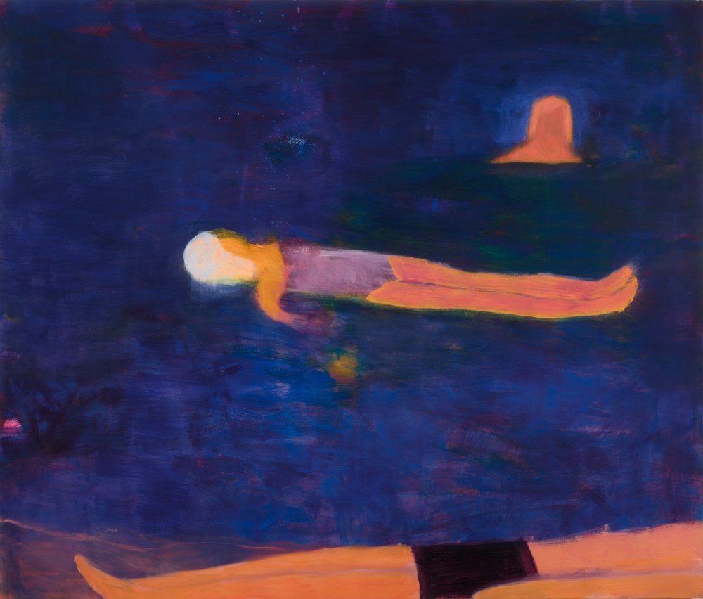
Katherine Bradford (United States, born 1942), Pond Swimmers, 2016, acrylic on canvas, 68 x 80 inches. Private collection. © Katherine Bradford. Photograph by Jason Mandella, courtesy the artist, Canada, and Sperone Westwater, New York
JD: Katherine Bradford once said, “The psychological is a recurring theme that I come back to, and explore what it’s like to be alone, what it’s like to be together, what it’s like to be alone together.” This statement aptly applies to the painting Ritual on view here. In this painting, the blues of the canvas suggest the universe that is all around us. A group gathers huddled together with their arms raised in unison as if in celebration. Maybe they are receiving a transmission from the moon or another celestial body (or are they sending something up to it?).
The subject, of course, is not of primary importance to Bradford. This painting, and many others in the exhibition, are also exercises in how to perfect fields of color, specifically in her quest to paint water and sky. While a legible horizon line cuts across the lower quadrant, it remains unclear if the figures are floating in space or swimming in the sea. In many ways, the use of paint to create luminous, transparent fields of color is the primary subject of Ritual.
KB: That painting was a big turquoise mess with a lot of drips on it. I saw little figures in it, so I kept making them. I made them all going in one direction. It originally was a horizontal painting.
When I turned it vertically, and had the wave diagonally going across it, it became a much more dynamic composition. When I finished the painting, I had to think about, “What have you done here? Waves and people running away from them? They’re scared of the waves?” I called it Fear of Waves.
I’ve done a lot of paintings with the title fear in them. I’ve done Fear of Shoes, Fear of Dark, and you notice that these are slightly absurd things to be scared of.
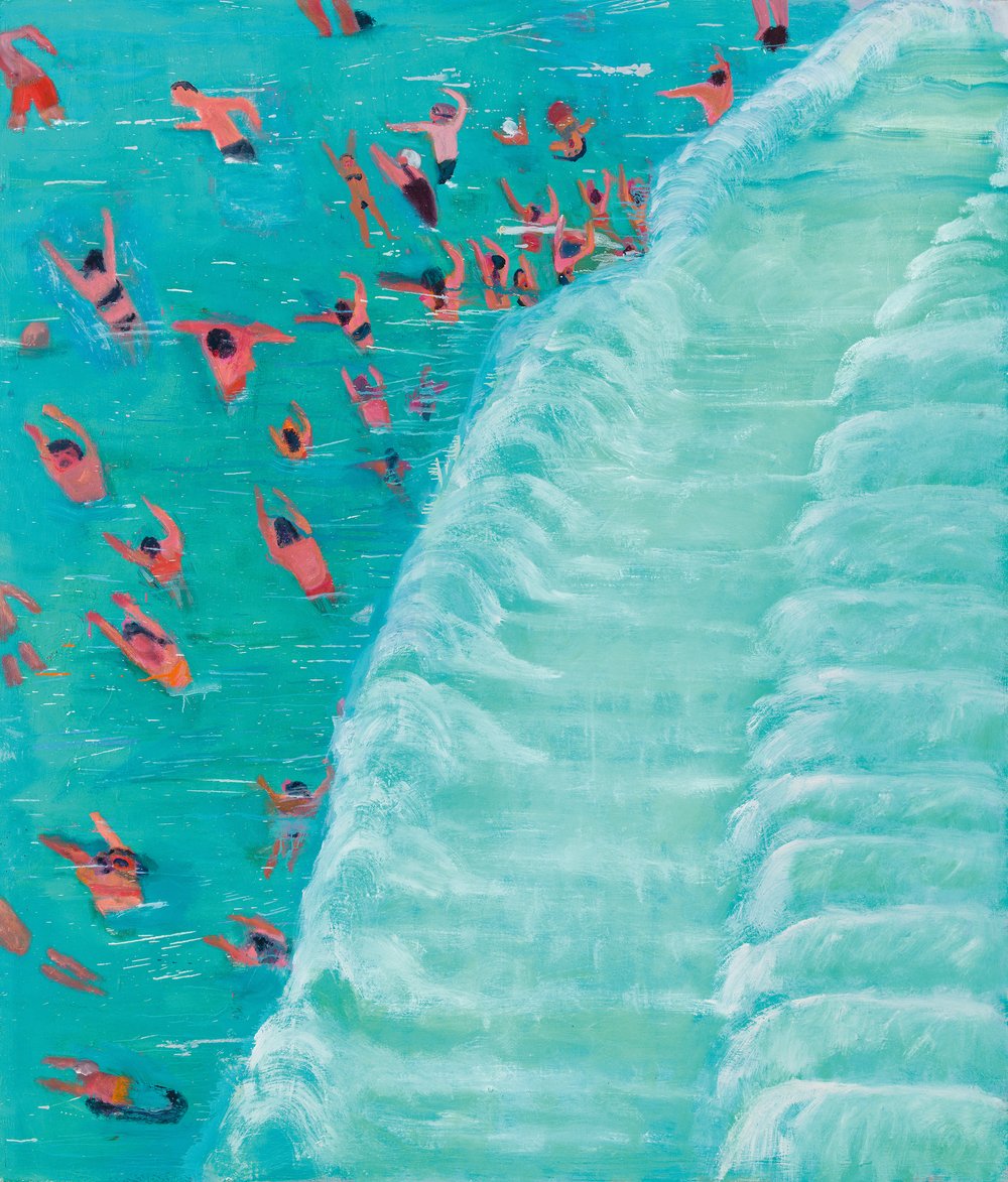
Katherine Bradford (United States, born 1942), Fear of Waves, 2015, oil on canvas, 84 x 72 inches. Collection of Peggy and Danny Comden, Los Angeles © Katherine Bradford. Image courtesy Jason Mandella
JD: Bradford’s painting Push Pull is an example of how her figures become larger in scale as the painter contorts their bodies to fit within the rectangular format of the canvas. At times, the bodies appear almost abstract like color fields or large blocks of paint.
In this painting, for example, a featureless, androgynous individual is held centrally in the frame by several limbs, both arms and legs, reaching from the left and the right of the canvas. They flank the central figure in an aggressive manner but, strangely, also support and even care for it. Is this “push pull,” or tug-of-war, between figure and ground a form of protection or a confrontation?
KB: I had seen a painting that a German painter did. He did it all in red line on a creamy ground, and I dared myself to do a painting like that.
I’ve done a lot of paintings of tables with people sitting around them and I got just the right red and just the right creamy ground, and I went, “Go!”
You know what was important was not to have it all done with just line. It was to have some solid red on it, and to make the people very animated. They’re eating and talking, because I was very animated and I wanted the tone of the painting to be kind of raucous and lively. When I was growing up, that’s how our family meals were, very loud.
The artists in this mill building that I’m in have lunch together in the summer. We laugh a lot and we throw food and we tell jokes and some people drink beer. It could be that this painting, which I did in the summer, was inspired by our raucous summer lunches together.
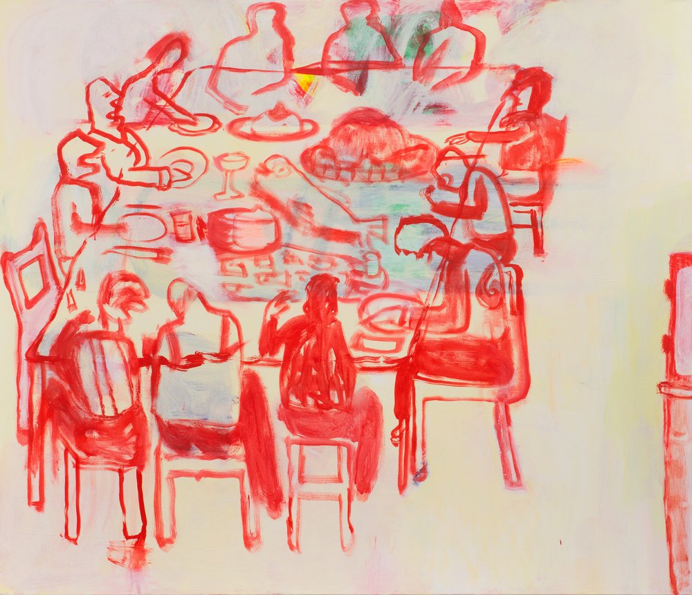
Katherine Bradford (United States, born 1942), Lunch Painting, 2018, acrylic on canvas, 68 x 80 inches. The Collection of Edwin Oostmeijer © Katherine Bradford. Image courtesy Joe DeNardo
KB: At the time I did Stripe People with Arms, I was more into stripes than arms. I really wasn’t even trying to make a plausible figure. I wanted the beauty of stripes. I think the anatomy of these people is awkward.
It’s again, chunks of color, and color next to color, which is propelling this painting. It could be a family. The arm, the top arm is way too long, but I needed it to be long, so that was good. I was making decisions that weren’t based on being correct.
As far as the gender, I like a lot of fluidity. I don’t see any point in trying to be very male, or trying to be very female. It just seems like an old fashioned idea. The characters in my paintings are often neither male nor female, or both, and I feel comfortable with that. I see us as an American society going in that direction, or at least being open to that idea.
AF: Take a moment to observe the lines and brushwork in the painting Yellow Dress. Follow the dark lines on the painting with your eyes. Notice the shapes that the lines form. Observe where one-line ends, and another begins. How many colors can you count in the lines that make up the figure? Look for where the color shifts in the bottom left corner.
While painting, Bradford is considering how colors look next to each other and in some paintings, big chunks of colors will propel the painting forward. Spend some time looking at the yellow color field and notice how there must have been some green paint mixed in with the yellow on the artist’s brush. How does this add interest to the large section of yellow paint ?
Bradford seeks to create a sense of vulnerability in her paintings. She means for viewers to be aware of where she struggled and made mistakes. Do you see areas that she might have painted over?
It is called pentimenti, where you can see that the artist has painted layers of paint over an earlier painting. Look for the layers of colors. Notice the texture that the buildup of paint has created. Imagine what the surface of the painting might feel like on your hand.
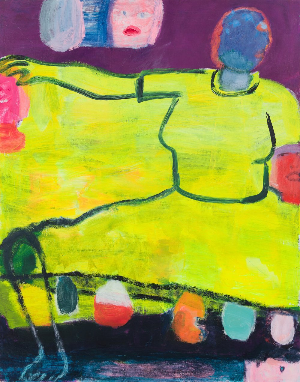
Katherine Bradford (United States, born 1942), Yellow Dress, 2018, acrylic on canvas, 84 x 66 inches. Private collection, Miami © Katherine Bradford. Image courtesy Jason Mandella
JD: The painting Couple No Shirts is a starting point of nostalgia and more pronounced introspection in Bradford’s paintings from 2018 to today. Its quieter scene and overall pleasant temperament suggest a more reflective tone for the artist. Some viewers and art critics speculate that this painting is a self-portrait of the artist and her wife Jane O’Wyatt. In it, the subjects of Couple No Shirts, for example, break conventions of gender and appear at ease with each other in doing nothing. They sit together yet alone in a welcomed silence and occupy a nondescript background of deep and dark magentas. The clothed sitter on the left places a hand on the shoulder of the bare breasted person on the right—a touch that is tender, not sexual, a gentle reminder of sharing space and intimacy. Common to any Bradford painting, Couple No Shirts is a significant study of color and form that only offers nibbles of information, leaving the viewer to question its narrative.
This painting is part of a series that Bradford made about motherhood. There is a sense of nurturing and care when looking at these three figures. The two figures on either side turn towards the central figure, each of their arms pointing inwards.
Notice how the central figure has a hand on each of the other figures – linking them all as a unit. The figures on the side are connected to the central figure through lines and colors – united yet separate, together yet apart. The figure in the center reaches their arms out in an act of care and support, almost like one lasting hug.
To me, there is a feeling of endless connection. No matter how much these figures might someday grow and distance themselves from each other, there will always be a strong connection, a solid line between them. We need that type of connection, of support, from people in our lives. And, whether that comes from a mother, a family member, a friend, a chosen family member, or anyone in our lives – connection, care, support, compassion, nurturing – these are essential to human life.
Think about how you now feel looking at this painting. Is there a specific emotion that you would attach to this painting? Make a gesture using your body or a part of your body that captures that feeling.
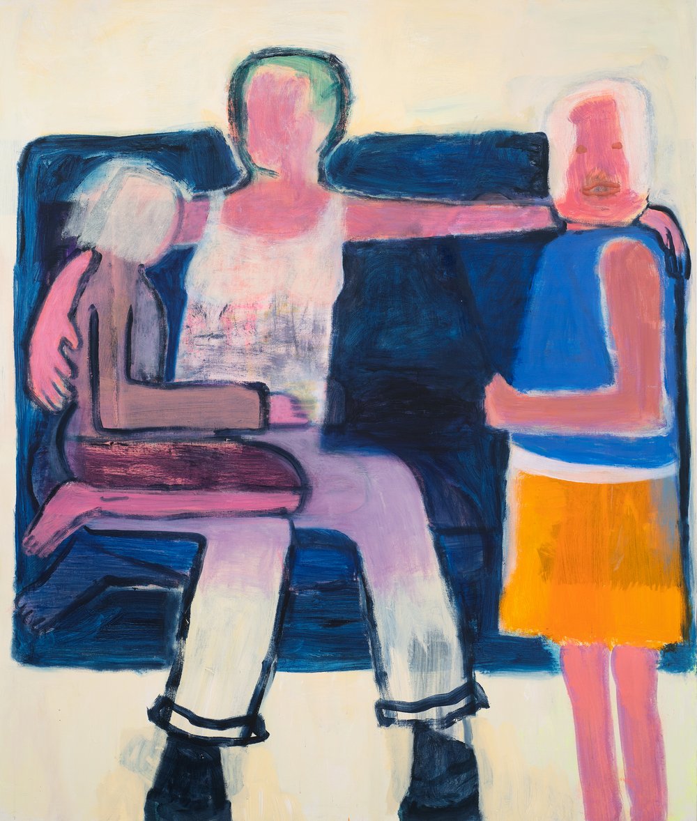
Katherine Bradford (United States, born 1942), Motherhood, 2021, acrylic on canvas, 80 x 68 inches. Private collection © Katherine Bradford. Image courtesy Joe DeNardo
Visit Exhibition Webpage
[ad_2]
Source link


